Brand new website launched

Hi 🙂

I have some exciting news to share with you all – I have a shiny brand new website which will showcase some of my work.

portfolio-website

I wanted to create a space where I could have an online portfolio and improve my HTML and CSS skills. I got to learn about Sass, Media breakpoints, Bootstrap and JQuery. In the end I also learnt to use Adobe Illustrator too so I could produce my own graphics.

This was a really exciting project and you can check out hemi.design for yourself, & let me know what you think in the comments below.

til next time
Hemi

Fitbit’s Dashboard Preview

The other weekend I got to travel to York to meet up with some of my girlfriends for a catch up and one of them had a Fitbit. Prior to this weekend I had not understood the desire to own one (my sister and Dad already one one each) but something changed….

During our 2 day trip Stacey would continuously update us on our number of steps achieved (we were walking a lot) and once we got to 10,000 we wanted to fight harder. Soon we were striving for 20,000. We felt a great sense of achievement with every milestone we met. It was uplifting, encouraging and felt damn good.

Since then I couldn’t stop thinking about how this little device had made me feel – I liked knowing I had achieved something and was gently contributing to improving my health. I asked Stacey about how she used it day to day and soon I discovered she was in competition with her other half and that was her key motivator.

Then it clicked – I could have this tiny little unobtrusive device that would encourage me to get up from my desk job and walk around AND most importantly I could beat Stacey, my sister and my Dad (plus several other friends that have now acquired one to join the competition).

So fast forward an Amazon Prime period and my Fitbit Alta arrives looking ever so stylish. I download the app, sync the Fitbit and land on the dashboard. And that is what I really want to talk about, you see, I was excited about the way they presented and encouraged me to try out their new feature.


At the top of the Dashboard I am presented with a bright eye catching pink banner – subtle enough not to get in the way, but present enough that I am intrigued.

Current Dashboard

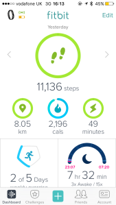
Current Fitbit Dashboard 2016

So I click because I’m curious as to how they have ‘improved’ the dashboard (being UX and all) and wondering how they are going to persuade me to make the switch.

I am presented with a short tour which I can swipe through. It outlines all the benefits of this new dashboard.

Tutorial - dashboard preview

Tutorial – Introducing the new dashboard

Tutorial - daily stats

Tutorial – Daily stats are now represented in a circular format

I am not immediately sure why circles are an improvement on bars, but I guess I can see more on my screen without scrolling and it’s kind of just a design thing. It takes me a few seconds to figure out what the different colours for the circles are but overall I like it.

Tutorial - tiles

Tutorial – Useful stats each have their own tile

Ooooo tiles, bit like Windows Phone, I’m on board with this. The supporting copy states each one has a unique look so I’m guessing things will be easier to distinguish now and the added information seems relevant.

Tutorial - personalise dashboard

Tutorial – Make the dashboard personal

Ah great, I can edit. Perfect. Now I’ll be able to make the new dashboard fit me, so perhaps this will ease the change. At this point I’m feeling 80% positive about giving the new dashboard a go and then I swipe to the final screen…

Tutorial - how to stop previewing

Tutorial – How to stop previewing

… 100% I am changing. It’s SO easy to turn it off if I don’t like it, clear & simple instructions provided. So I take the plunge and hit ‘Check it out’.

New dashboard

The new Fitbit dashboard

Bosh, there is the new dashboard with it’s little tiles all ready and waiting for me. I have a flick through and decide that actually, I don’t even need to edit the ordering since the things I care most about I can see without scrolling. I love the little icons (although the calorie and minutes ones still baffle me) and the colours, subtle rounding etc. it feels friendly, approachable, like with each of my steps I’m feeding this little pet.

And I am hooked.


I loved this experience of trying a new feature – often its just a link at the bottom of the page or sometimes changes are forced upon you, but this Fitbit, I commend you. I really enjoyed the whole flow, improvements where clearly stated, I could see previews of what it would look like and I was given clear instructions on how to abort.

If only others followed Fitbit’s lead.

What do you think of the flow? Have you got any better ideas? Let me know in the comments below.

til next time
Hemi

p.s. see you the other side of 10,000 steps

Building a user experience experience
Video

Creative meet up – they let me talk

Back in October 2015 the lovely guys at Creative meet invited me down to Chichester to talk about experiences – my experience, your experience, your mum’s experience, the customers experience. Because what’s the point in making all these cool things if we aren’t making things easier?

You can watch my talk here – unfortunately the quality isn’t fantastic so here are the slides.

I had a great time sharing my experience and answering everyone’s questions. Looking forward to doing more talks in the future!

til next time
Hemi

Travel website - Destination

Destination – A travel website

Hello, it’s me….

I’ve been working through this course on Springboard and it got me all fired up to design something again. I had this image in my head of a travel website (probably because I’ve been on holiday recently so these sites were fresh in my mind) and immediately sketched my idea.

Initial sketch for Destination

Admittedly it was all a bit hasty as I just wanted to get something out there so headed over to PowerPoint and got straight to it.

I knew I wanted to use a vertical navigation as earlier in the week I had been researching different navigations, and this layout had left an impression on me.

After researching elements and contributing to a style guide I knew I wanted to use the new field design where the labels are inside the box.

Here is what I came up with – it is by no means perfect, but I thought it would be good to share what I achieved in a couple of hours.

Home page - Destination

Home page - Flight Home page - Flight and Hotel
Home page - Hotel
Log in screen
Sign up Screen

Let me know what you think 🙂 I’d love to hear your thoughts on how I can improve.

til next time
Hemi

Hemi Trenholm Banner

Tinkering with Photoshop

Hi again 🙂

Bit of background – I have never really used Photoshop. In fact, the only thing I know how to do is re-colour things using the colour overlay option for blending layers. However, I do want to learn how to use the Adobe Suite as it seems to be one of those things the industry expects user experience personnel to be proficient in. Today I got tinkering with Photoshop and thought I’d share what I did.

I never intended to end up in Photoshop. Earlier in the week Moo sent an amazing sample of their new tailored business cards where I work and on a lazy Sunday afternoon I found myself browsing their site. I ended up downloading their Photoshop template and set about trying to design a card (which later I ditched in favour of a blog banner).

I started by colouring the background using the paint bucket tool and then created a new layer for some text. I love beautiful typography and get inspiration from Pintrest on a weekly basis, so it was only natural that I was going to grab a font from my board. I wanted an accent font that followed the brush script trend and eventually settled for Beacon. Then I tweaked with the rotation and spacing of the words until I was happy.

Work in progress

Background and accent font

Next I added another layer for my supporting text (another excuse for more typography hunting), and selected the simple Raleway. This is where I then had a ditsy moment, I couldn’t work out why I couldn’t see my text.

I had selected a light grey, which was a different colour than what I had used for the background and positioned it so that it was the top layer, but still I couldn’t see it. I ended up having to ask my partner and he took a look and discovered that it was a simple problem caused by lack of contrast. The grey I had selected was too similar to the background! After pumping up the contrast it was a simple job of aligning once again.

Work in progress

Adding the main font for header and body

That was all relatively simple but I was getting stuck in now so decided to try something else. I really love the gold foil effect at the moment (I blame Pintrest again for that) and hunted around on the net for a tutorial on how to make gold foil typography in Photoshop.

Work in progress - gold foil

Tweaking the gold foil effect

I stumbled across this gem from Dustin Lee and quickly began following his easy steps. However, I hit a stumbling block when my Filter Gallery was greyed out. After a quick Google I changed my colour mode from CMYK to RGB and I was away again.

After using the clipping mask, arranging my layers and final layout tweaks I ended up with this which I turned into a banner for one of my previous posts. I’m still not 100% sure about the placement of the secondary text and will probably tweak it a thousand times more but here it is for now…

Style Guide Banner

Style Guide Part One

I had great fun doing this and it’s definitely made me a lot less apprehensive to tinker around on Photoshop again. As you can see from the featured image I later went on to make a silver foil and am going to use my new skills to design my best friend’s bridal shower invites.

If you have any idea on how to use the Filter Gallery in CMYK mode or any other tips, leave me a comment below!

til next time
Hemi

Style Guide Banner

Consistency – decision to build a style guide

When I first started my post graduation role I stumbled around internal documents searching for a style guide. The closest I came to was a 2 year old PDF that contained typography ideals and a colour palette for the marketing site.

The problem

As I familiarised myself with the software I would stumble across an array of button styling and inconsistent wording. For example ‘Download PDF’, ‘Download as PDF’, Download to PDF’ and ‘PDF’. It became very clear that there were no standards and each developer had built their own version every time.

Research part one

To confirm my suspicions, I went through the software and took screenshots of all the different components and documented them in a presentation. Below are a few of these to illustrate some findings.

The software had primary buttons of different sizes and all had different css/html.

Different primary buttons

So many blue primary buttons

The secondary buttons again suffered from an array of sizes and ambiguous wording. The image below also shows ‘save’ as a secondary button – was this not meant to be the key thing the user needed to do?

Different secondary buttons

50 shades of grey in all sizes for secondary buttons

Then there were destructive buttons that quite frankly looked like they were primary buttons. Their similar appearance and emphasis made the negative actions stand out too much.

Destructive buttons

Destructive buttons that look all too tempting

There were also some strange buttons that colour wise, didn’t fit with anything else. And the strange case of ‘available’ looking like a button but in actual fact was not clickable!

Traffic light buttons

Traffic light buttons and one that isn’t a button

Drop down selectors again showed further inconsistency…

Drop down selectors

Monochrome mess of selectors

And checkboxes and radio buttons also suffered the same fate, including my pet hate of a single row of radio buttons which makes it hard to distinguish rich radio is for which label.

checkbox and radio discrepancies

To the right, to the left

Research part 2

I was concerned that this was having a detrimental impact on our customers. Not only was wording and styling inconsistent, but so was the layout. On some pages buttons were left aligned, others right aligned. I conducted user testing and it soon became clear that every participant missed the buttons that were right aligned.

In user testing I also discovered that users took between 1 and 5 minutes to hover over icons, trying to decipher what they represented and which would carry out the action they wanted.

Different delete icons

Some of these aren’t even for delete…

Our users were left confused and nervous and I knew things needed to change.

Presenting findings

I presented my findings to the design team and they were shocked at the screen capture videos which showed users fumbling around. Especially since these users had accounting knowledge and had all used the software for 2 years plus. If our established users had this difficulty you can only image what it must be like for a new user.

Now the team had acknowledged the problem and were on the same page it was time to brainstorm a solution. After attending Epic and hearing Ben Scott‘s talk on life after style guides at the BBC the design team was inspired to start their own.

Style guide

We looked at numerous style guides and saw Kiran Matthew‘s as a starting point. Then we brainstormed what things we wanted to include in the guide.

  • Guide to Gridset
  • Typography overview
  • Colour palette
  • Icon usage
  • Components
Style guide components

Components for the style guide

Next we presented our idea to the product team and gathered requirements form them. It was then decided that we would create a working style guide inside the application with code snippets so that developers could copy and paste when needed, saving them time and giving them confidence that what they were building would not be detrimental to the user.

I aim to write a few posts on the style guide as I start to define rules for each of the components listed above, so that you can gain an insight into the decisions I made.
Let me know if you have any advice for building style guides in the comments!

til next time
Hemi

Proposed marketing website navigation

Marketing Site Navigation

Task

One of the first tasks I was given post graduation was to make an events page more discoverable on a marketing website. I was given complete and utter free reign of the website and let loose. Honestly, I had never done something like this before so I did what any other sane person would do and Googled.

How I went about it

I read a lot of articles on my commutes and came to the conclusion that a competitor analysis, analytic’s and card sorting would do the trick. So off I set about learning how to use Google Analytics. Thankfully they have an extensive support area and many a people have written lovely blogs on how to retrieve the information I needed. Now I had some data to make some informed decisions.

What I found out during research

Analytic’s revealed that the events page attracted around 700 page visits per week.

I also discovered that there were lots of pages that were only linked to within paragraph copy and suffered poor page views. Bounce rates were high and the user flows weren’t what we expected at all.

I started to track the analytic’s weekly for 10 key pages in a spreadsheet and plotted them on graphs which became my dashboard. Then I set about tweaking the navigation and watched the effect it had on the numbers.

What I did next

Using Microsoft Visio I mapped out the current navigational flow and reviewed the ease of getting to pages.

Then I conducted a card sorting exercise with various team members and displayed this on the wall so it would become a conversational piece for the company.

Current navigation

Current navigation

Proposed navigation

Proposed navigation

Now we had a solution for the navigation which made the events page more accessible as it was included in the global navigation and improved access to other pages. However, tweaking the navigation alone wouldn’t solve all the event page issues so I took another look at the customers journey on that page.

The events page itself did not make it clear which audience each event was aimed at. There was several child pages all with completely different branding and the copy across them all varied wildly.

I created some wire frames using Balsamiq and shared these with the team. I asked marketing to review the copy, front end to remove unnecessary pages and design to give the page a fresh look.

The result

Original navigation and events page

Navigation and events page May 2015


Improved navigation and events page

Navigation and events page August 2015

Proof is in the pudding – the event page climbed to 980 page views per week and we saw a dramatic increase in other key pages such as small businesses and customer happiness.

What I learnt

Analytics’s is key. Don’t start making decisions without consulting the numbers, but also remember that they are not gospel. Take a look at other influencing factors for example, the blog attracted around 1500 extra page views when the CEO posted.

My tip would be, know your numbers inside out and when there is a dip or increase, investigate. Find out why, what caused it, should we do more or less of this?

til next time
Hemi

Graduation

Catch Up

I haven’t posted in a while so before I start bombarding this blog with content I wanted to explain where I’d been, so…

I graduated in June 2015 from the University of Kent with a 1st class honours degree in Computer Science with a Year in Industry. Since then I took a role at a cloud accounting software company as their sole UX designer.

Graduation

My family and I at graduation

Things got a little hectic being the only UX person at work and then I took on another role as Product Owner so things got twice as busy. It wasn’t all work and no play though. Admittedly I’ve been having fun creating houses in Minecraft, building the dream.

Then 2016 knocked on the door and I realised I had neglected this blog which was rather silly of me since I’ve learnt so much since taking up my first role since graduation.

So what I would love to do in my upcoming posts is share some of the things I’ve learnt in the last few months and hopefully it will give you an insight into my user experience journey.

til next time
Hemi

HexaPlaque

My final year project at university has been the subject of previous posts and today I wanted to share with you where we got to.

Background

I worked with Alex Hussey to provide an app based solution for the RSA Student Design Awards brief entitled ‘Heritage by Design.’ Our aim for the project was to create an attractive design for an app or system that would help people and communities better connect with and celebrate heritage. We conducted various interviews and research sessions with potential users in order to accurately identify what would be necessary to implement a system of this scope. The final design, HexaPlaque, allows users to share their stories with the world, and to see how they are connected to the world around them.

Fruits of our labour

HexaPlaque Storyboard

HexaPlaque Storyboard

Learn about HexaPlaque in 250 words.

View our poster we created for the university project fair which gives a high level view of our research and simplified storyboard of the final solution.

Then watch the story of HexaPlaque in PowerPoint to see our complete journey.

See the Design Evolution of a HexaPlaque – our alternative to the traditional blue plaque.

We got an award

Alex and I received the Kent Innovation and Enterprise Prize for Computing 2015 for HexaPlaque.

The award recognises the Final Year Undergraduate Student Project that is both innovative, and impactful to the range of external clients that the Kent Innovation and Enterprise Centre engage with.

The future

There was some initial interest from Canterbury council but at the moment Alex and I are concentrating on other adventures. However, we’d love to hear from you if you’re interested in our project HexaPlaque and it’s future.

til next time
Hemi

Card Sorting Participant J

Getting Down with Card Sorting

Thought I would share some exploratory research from my final year project, HexaPlauqe, that I completed with Alex Hussey.

Our brief from the RSA Student Design Awards was “Design a way for people and communities to better connect to and celebrate heritage”. As it was so broad we had a lot of options but were not sure what heritage meant to people.

We got talking about heritage vs. vintage and retro and decided to survey people to discover their viewpoints. Whilst designing the survey we thought about having a question where we presented the participant with a few photos of objects such as a war medal and ask them to categorise it as either heritage, vintage or retro. As we were deciding on objects I thought, why don’t we expand this? The idea for changing our research to Card Sorting was then born.

We began by selecting objects we associated with the different categories (Roman coin, war medal, space hopper), and those we thought were more subject to opinion due to authenticity issues (baking bowls, town bike, fashion) and created cards with an image of the object and a label.

We then divided a whiteboard into quadrants – one for each of the categories, heritage, vintage, retro and other – and asked a few test subjects to place the cards into what they deemed to be the most appropriate category.

However, after completing a couple of tests we reviewed our process and decided to remove the words from the cards so that people could make their own interpretation. We also adjusted some of the images to make them clearer for example fashion went from a general blogger’s picture of their outfit to one of Twiggy in the 60’s accompanied by an image of current designer Orla Kiely’s 60’s inspired outfits.

Blogger's Fashion

Before: Fashion Picture

Comparative Fashion

After: Fashion Picture

We also added objects for literature, film and historic architecture. The last change was to switch the ‘other’ category on the quadrants to ‘classic’ and allow participants to place objects that didn’t fit one of the four categories outside.

Card Sorting Objects

The Final Collection of Card Sorting Objects

Here are a few of photos of participants responses. I scribed everything participants said when placing objects and circled (in red) the object they most identified with and why.

Participant - Adele

Participant A – Masculine vs. Feminine

Participant - Chrystal

Participant C – Strict Vintage Criteria

Participant - Hannah

Participant H – Authenticity

This exercise was great as it gave us both quantitative and qualitative data. We were able to observe participants dilemmas and thought process which lead to insights such as masculine and femininity and the importance of authenticity. In addition, we could also analyse the frequency that each object appeared in a category.

For example, the town bike ended up in all four quadrants as many couldn’t decide if it was heritage, as it was first designed a long time ago, classic, as it has withstood the test of time, vintage, as it is now fashionable to own one, or simply retro.

Items like the floral fabric very much depended on people’s personal connections and experiences. Many placed this item in retro although questions of its authenticity were raised – some identified it as a modern Cath Kidston print, whereas others thought it may be original 70’s wallpaper.

Results

A Selection of Results

Through doing this Card Sorting exercise we learnt that many of the interpretations people have of these words are subjective, and there is not a definitive definition for any of them. People interpreted the categories based on the connection they had with the items and their feelings based on this. Many of those interviewed had their own specific ideas as to what constituted each category, but still had difficulty in placing all of the items.

I’m really glad we chose Card Sorting as it was incredibly insightful and inspired our final design to focus on personal connections with heritage. I think this is a really great research method when you’re presented with a broad term that needs defining, and was my favourite piece of research we carried out for the project. I urge you to give it a go, let me know how it turns out 🙂

til next time
Hemi